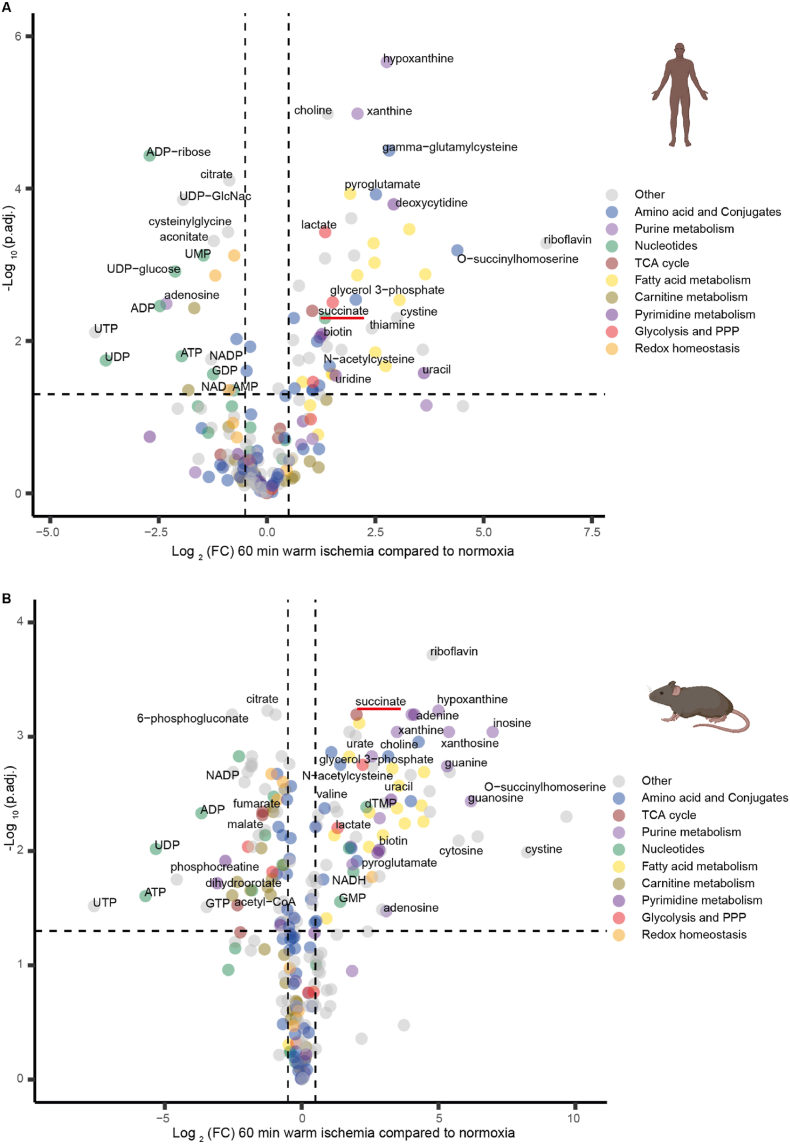
Fig. 2.
Volcano plots showing changes in metabolite levels following 60 min ex vivo warm ischemia compared to normoxia. Human (A) and mouse (B) brain tissue data are shown. The volcano plots show -Log10(adjusted p value (p.adj.) calculated by Benjamini-Hochberg procedure), plotted against Log2(fold change (FC)), where fold change is that comparing the change in abundance of metabolites after 60 min warm ischemia versus normoxia. Metabolite abundances are given in Supplemental Tables 2 and 3 and Log2(FC) and -Log10(p.adj.) were calculated from these data. Each dot represents the mean of 8 replicates for human and of 4 replicates for mouse. Metabolites from different metabolic pathways are color-coded and key metabolites and/or those that change to the greatest extent are labeled. (For interpretation of the references to color in this figure legend, the reader is referred to the Web version of this article.)

