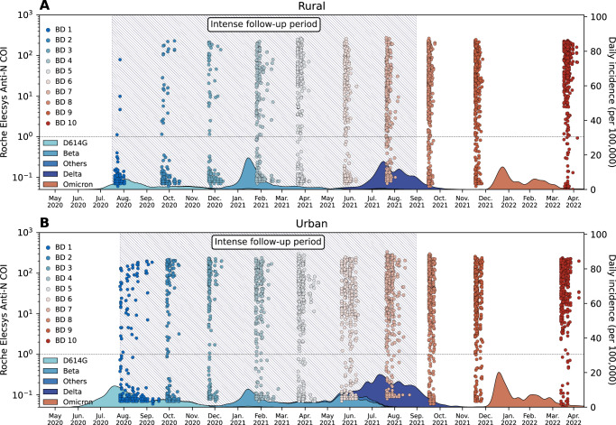
Fig. 1. PHIRST-C study June 2020 – April 2022, SARS-CoV-2 serology and epidemiologic curve in the two study sites.
A Serum samples and epidemiologic curve in the rural site. Dots represent the Roche Elecsys Anti-SARS-CoV-2 nucleocapsid assay cutoff index (COI) at different timepoints of the serum specimen collections; Each dot represents one serum specimen collection, with dot color denoting blood draw collection time, from blue (early) to red (late). The shaded curve at the bottom represents the daily incidence of SARS-CoV-2 cases in routine surveillance data collected from the Ehlanzeni District, Mpumalanga Province. Colors of the shaded curve represent different variant types. Here, blood draw (BD) 10 was collected at the end of the first Omicron wave. Since in South Africa, Omicron BA.4 and BA.5 only started to rise at April, 20228, we assume the Omicron wave prior to BD 10 were BA.1 and BA.2 subvariants. The hatched area represents the period of intense follow-up of the PHIRST-C cohort, when nasal swabs were collected and tested on rRT-PCR at twice-a-week frequency. B Same as (A) but for the urban site, with shaded curve at the bottom representing routine surveillance data collected from the Dr. Kenneth Kaunda District, North West Province. BD Blood draw.

