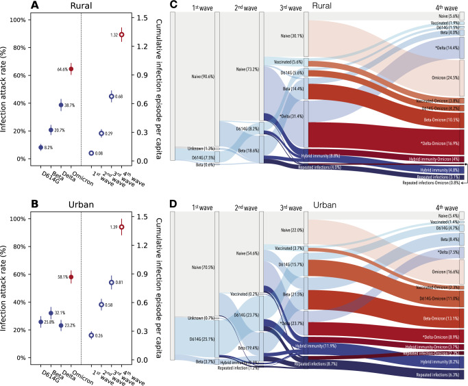
Fig. 2. SARS-CoV-2 infection attack rates and shifts in immunologic landscape.
A Infection attack rates in the rural site by variant type (left) and the cumulative number of infection episodes per capita after each epidemic wave (right), based on n = 905 participants. Dots and lines represent mean and 95% confidence intervals. The end of the 1st wave is marked by blood draw 2, 2nd wave is marked by blood draw 5, 3rd wave is marked by blood draw 8, 4th wave is marked by blood draw 10. B Same as (A) but for the urban site. C Sankey diagram demonstrating the distribution of different type of immunologic exposures (including vaccination and infection) in the population of the rural site after each epidemic wave and the transition of immunologic exposures in-between waves. In the Sankey diagram, rectangular nodes of the same color represent proportion of population of a given immunologic state: gray color represents SARS-CoV-2 immunologic naïve individuals; blue shades represent non-Omicron exposures; red shades represent Omicron exposures; darker colors represent repeat exposures while transparent shading represents primary exposures. Each column of nodes represented the distribution of immunologic state within the cohort population post a given epidemic wave. The vertical height of a node is proportional to the fraction of the population with the specific immunity. The band connecting nodes between waves represent the fraction of population (proportion to band width) transitioning from one immunologic state to another due to the impact of the epidemic wave of interest. D same as (C) but for the urban site. *In additional to Delta, here also includes other less frequent lineages including other lineages including Alpha and C.1.2 variants.

