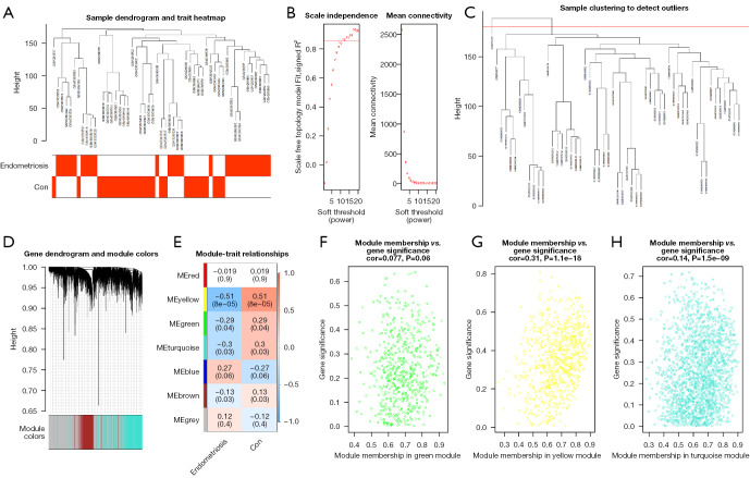
Figure 3.
Construction and analysis of weighted gene co-expression network. (A) Clustering and phenotype in the combined data samples; the clustering is shown in the upper part of the figure, and the phenotype is shown in the lower part. The color stands for disease. Red square, the correlation between the disease or control group and the sample is 1; white square, the correlation between the disease or control group and the sample is 0. (B) Ascertainment of the soft threshold. (C) Merging of similar modules based on the dynamic cutting tree algorithm. (D) Clustering dendrogram of genes with various levels of similarity according to the topological overlap and the assigned module color. (E) Heat map for the association between various modules and clinical characteristics. The ordinate stands for various modules and the abscissa stands for different traits. Each block indicates a module’s and a trait’s correlation coefficient and P value. (F-H) Correlation between module membership and gene significance in the green module, yellow module and turquoise module. Con, control.

