
Figure 3. Large-Scale Somatic cis- and trans-sQTL Analysis.
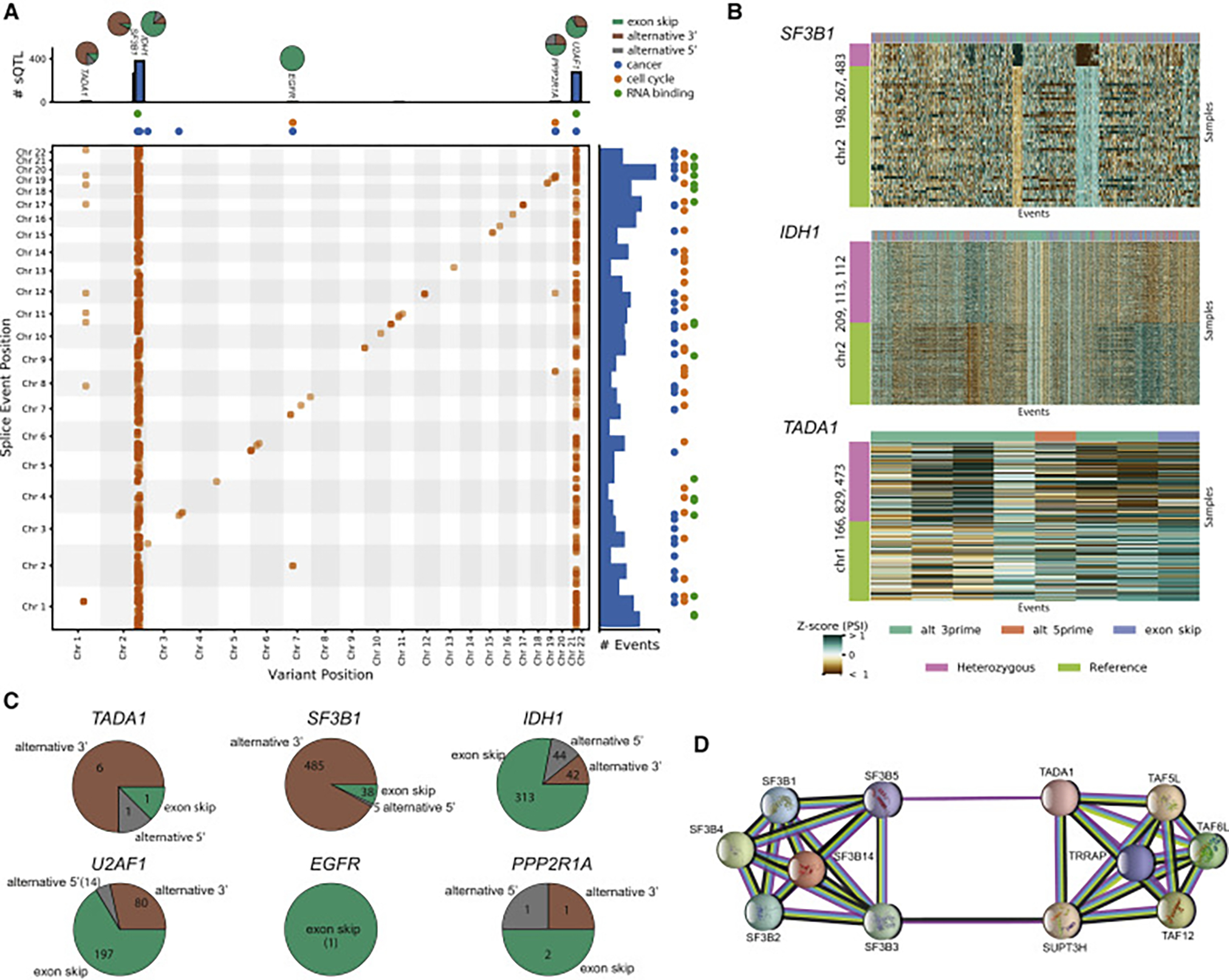
(A) Two-dimensional Manhattan plot with location of a variant (x axis) associated (p ≤ 0.05 after Bonferroni correction separately for cis and trans associations) with an alternative splicing event at a separate location (y axis). Points along the diagonal correspond to cis associations (window 1 Mb) and the remaining points correspond to trans associations. The marginal bar plots show the number of splicing events found to be associated with a single variant (top) and the number of associations found for each alternative splicing event (right). The colored points indicate whether an alternative splicing event or sQTL is within an RNA binding gene (green), cancer census gene (blue), or cell cycle gene (orange). The pie charts on top of the bar show the breakdown of splicing event type composition of the sQTL targets. Brown indicates alternative 3′ events, gray alternative 5′ events, and green exon skip events.
(B) Heatmaps of selected trans-sQTL: PSI z scores of alternative splicing events (columns) significantly associated in trans with the variant. The color bar on the left shows the mutation status for each sample (rows). For visualization purposes, the heatmaps are downsampled to highlight the differences.
(C) Pie charts from (A) detailing the distribution of splicing event targets across three categories (alternative 5′, alternative 3′, and exon skip events).
(D) Protein-protein interaction network of TADA1 and some selected partners (e.g., SF3B5).
See also Figure S2.