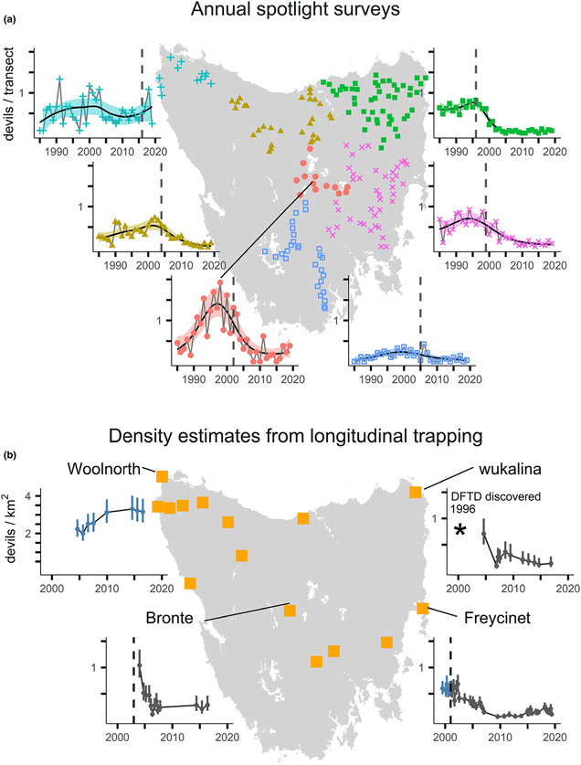
Figure 2.
Maps of study sites and trends in the spotlighting and trapping datasets. (a) The map shows the centroids of each of 172 10-km long spotlight transects. To visualise the broad-scale trends in devil detections, we aggregated transects into the national bioregions (IBRA DSEWPC 2013). The data points show the mean number of devil detections within a bioregion. For visualisation purposes only, the trend lines show the mean estimates from a generalised additive model with 95% confidence band. See Fig. S1 for a finer-scale visualisation of the spotlighting data. (b) Yellow squares show the locations of trapping sites, including those reported by Lazenby et al. (2018) as well as those analysed in this paper. We present four example time-series of devil densities (95% CI) estimated using spatially explicit capture-recapture, with blue and grey points representing densities before and after the arrival of DFTD respectively. The estimates for Bronte, wukalina and Woolnorth come from Lazenby et al. (2018), and we present all density estimates in Fig. S2. In all graphs, the vertical dashed lines denote the approximate year of DFTD arrival to an area. * denotes that disease was discovered at wukalina in 1996, which is earlier than the range of the x-axis.

