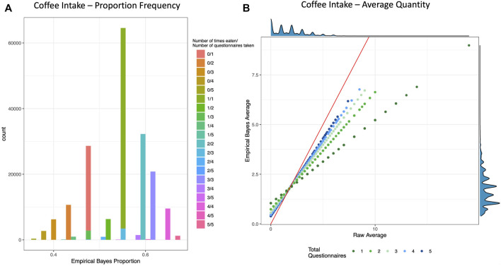
FIGURE 1.
Empirical Bayes Proportion and Average Transformations: Coffee Intake. These example visualizations of coffee intake depict the shrinking of raw values for individuals with fewer total questionnaires. (A) Histogram of Empirical Bayes proportion colored and stacked by the crude proportion (number of times an individual reported drinking coffee out of how many total questionnaires that individual took). (B) Scatter plot of the crude average (x-axis) vs. the Empirical Bayes Average (y-axis) of cups of coffee per day, colored by total number of questionnaires taken. The red line is the line of identity, and the density plots are depicted on the top and right borders. See Supplementary Figure S3 for more examples.

