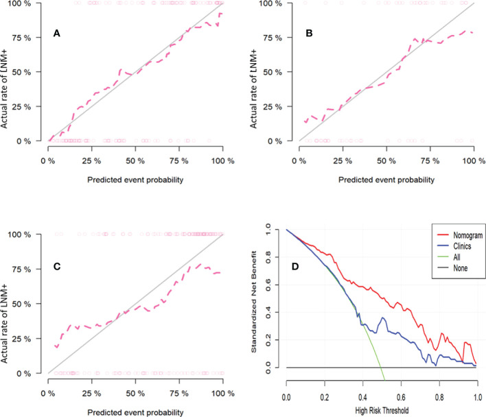
Figure 5.
The calibration curves for the nomogram in training cohort (A), internal validation cohort (B) and external validation cohort (C). The diagonal gray line represents a perfect prediction by an ideal model. The pink dotted line represents the performance of the nomogram, of which a closer fit to the diagonal gray line represents a better prediction (Hosmer-Lemeshow test all p-values >0.05). Decision curve analysis of nomogram to investigate the clinical usefulness in predicting lymph node metastasis (D). It indicates the nomogram model obtains more benefit than “treat all”, “treat none”, and the clinical model when the threshold probability is >10% in training cohort.

