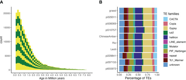
Figure 5.
TE age and composition. (A) A stacked bar plot describing the distribution of TE counts by age across all genotypes. Alternating colors indicate different genotypes, and distributions are stacked in the order of the labels in figure 5b (i.e., the bottom yellow distribution shows the TE age frequencies for pi655972, while the top shows the distribution for Grassl)., T he Y-axis is number of TEs and the X-axis is their age in millions of years. (B) The proportion of superfamilies of TEs based on average counts of each superfamily across all genomes.

