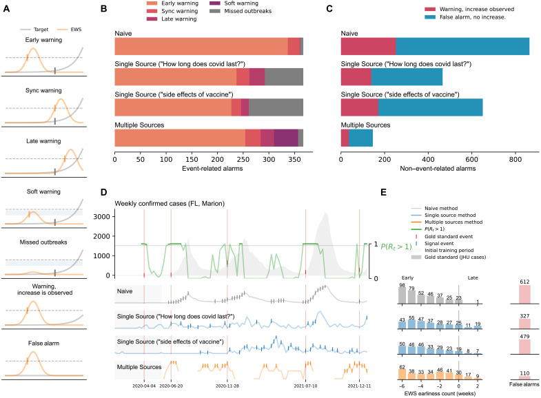
Fig. 1. A summary of our results at the county level.
(A) Graphical representation of the different outcomes observed in our methods: early warnings, synchronous warnings, late warnings, soft warnings, missed outbreaks, warnings with increased activity, and false alarms. (B) Summary of the outbreak onset events. Horizontal bars are colored, from orange to purple, depending on the event class. (C) False alarms for the Naive, Single Source, and Multiple Source methods. The Multiple Source method produced the lowest amount of false alarms (110). (D) Probability of resurgence P(Rt > 1) and different events generated by the Naive, Single Source (Google Trends “How long does covid last?” and “side effects of vaccine”), and Multiple Source methods. (E) Earliness of the alarms triggered by each method. Bars represent the number of alarms within the out-of-sample time window.

