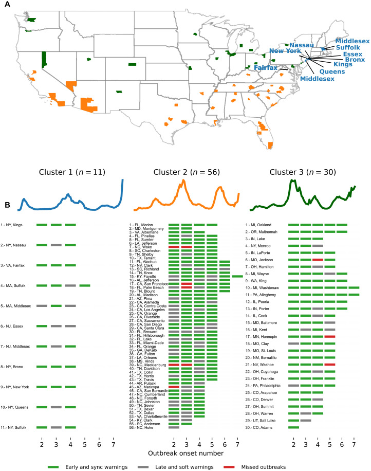
Fig. 3. Clustering analysis at the county level based on confirmed COVID-19 case trajectories.
(A) The geographical map color codes each location based on their cluster. A total of three clusters described groups of counties that experienced their first outbreak onset early in 2020 (blue), during summer (yellow), and late in 2020 (green). (B) Blue, magenta, and gray markers correspond to the performance of the Multiple Source method for each out-of-sample outbreak onset. For example, the first location in cluster 1, Kings (NY), experienced three out-of-sample events: All of them were either early or synchronous warnings.

