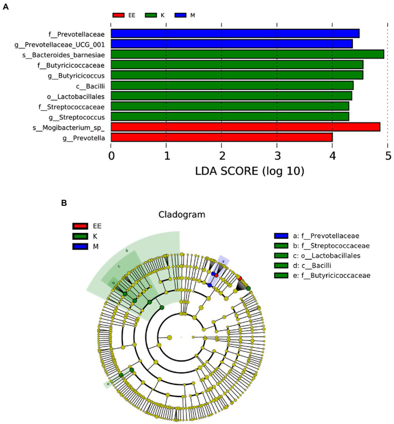
Figure 5.
Analysis of species differences between groups. (A) Histogram of the distribution of LDA values; (B) Evolutionary branching plots, N = 5. Species with LDA scores greater than the set value (set to 4 by default), biomarker with statistical differences between groups, are shown in the histogram of the LDA value distribution. In the evolutionary branching diagram, the circles radiating from inside to outside represent the taxonomic rank from phylum to genus (or species). Each small circle of a different taxonomic level represents a taxon of that level, and the size of the diameter of the small circle is proportional to the relative abundance size.

