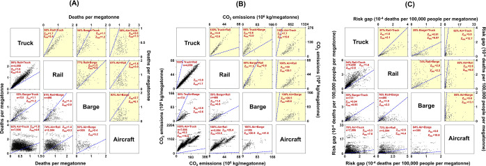
Figure 1.
Pairwise health, climate, and exposure disparity impacts from each origin–destination (O–D) pair by mode. Each dot in the scatterplots represents one O–D pair. (A) Deaths per megatonne payload from PM2.5, (B) carbon dioxide (CO2) emissions in kg per megatonne payload, (C) health risk gap between most-exposed racial–ethnic group and population average (deaths per 100,000 people per megatonne payload). In panels (A)–(C), the lower six plots (background color: white) show all O–D pairs in common between the two modes; the upper six plots (background color: yellow) show the n = 214 O–D pairs that are common across all four modes. The blue dashed line signifies y = x. Percentages in each plot show percent of data points above y = x line for a mode. For example, 99% of the n = 4858 truck–rail O–D pairs have greater health impacts from rail than truck. ZSA (ZWA) represents the ratio of simple average (2017 tonnage-weighted average) of the mode with a greater percentage to the mode with a lower percentage. For example, for truck–rail O–D pairs, ZSA = 1.6 means average deaths per megatonne for rail are 1.6 times of truck and ZWA = 3.2 means tonnage-weighted average deaths per megatonne for rail is 3.2 times of truck.

