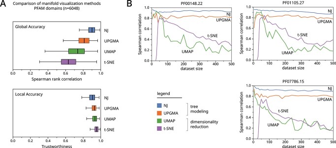
Figure 3.
We benchmark the performance of various manifold visualization methods using 6048 protein domain sequence datasets from Pfam. (A) Boxplots show the accuracy of manifold visualization methods shown across the y-axis. The top graph shows Spearman rank correlation which measures how well global distances are preserved in the visualization. The bottom graph shows trustworthiness which measures how well local neighborhoods (k=10) are preserved in the visualization. Expanded benchmarks are provided in Supplemental Figure S1. (B) We show the effect of dataset size on three poorly performing datasets across dimensionality reduction methods.

