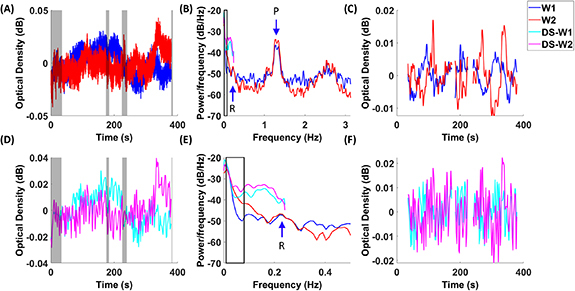
Figure 2.

fNIRS time courses and spectrums. Temporal traces of raw data in fNIRS (A) and down-sampled fNIRS (D) are plotted in two wavelengths (W1: 760 nm, W2: 850 nm), with gray shaded areas indicating the rejected time segments with motion artifacts. Power spectrums of fNIRS and down-sampled fNIRS are shown in (B) and (E), with black squares indicating the range from 0.009 to 0.08 Hz. Panel (E) is the enlarged portion of Panel (B) from 0 to 0.5 Hz. Band-pass filtered time courses in fNIRS (C) and down-sampled fNIRS (F) are illustrated. An arrow labeled with ‘P’ indicates the peak associated with cardiac pulses in the signal. An arrow labeled with ‘R’ indicates the peak associated with respirations in the signal. Red and blue lines indicate originally sampled data, while pink and cyan lines indicate down-sampled data.
