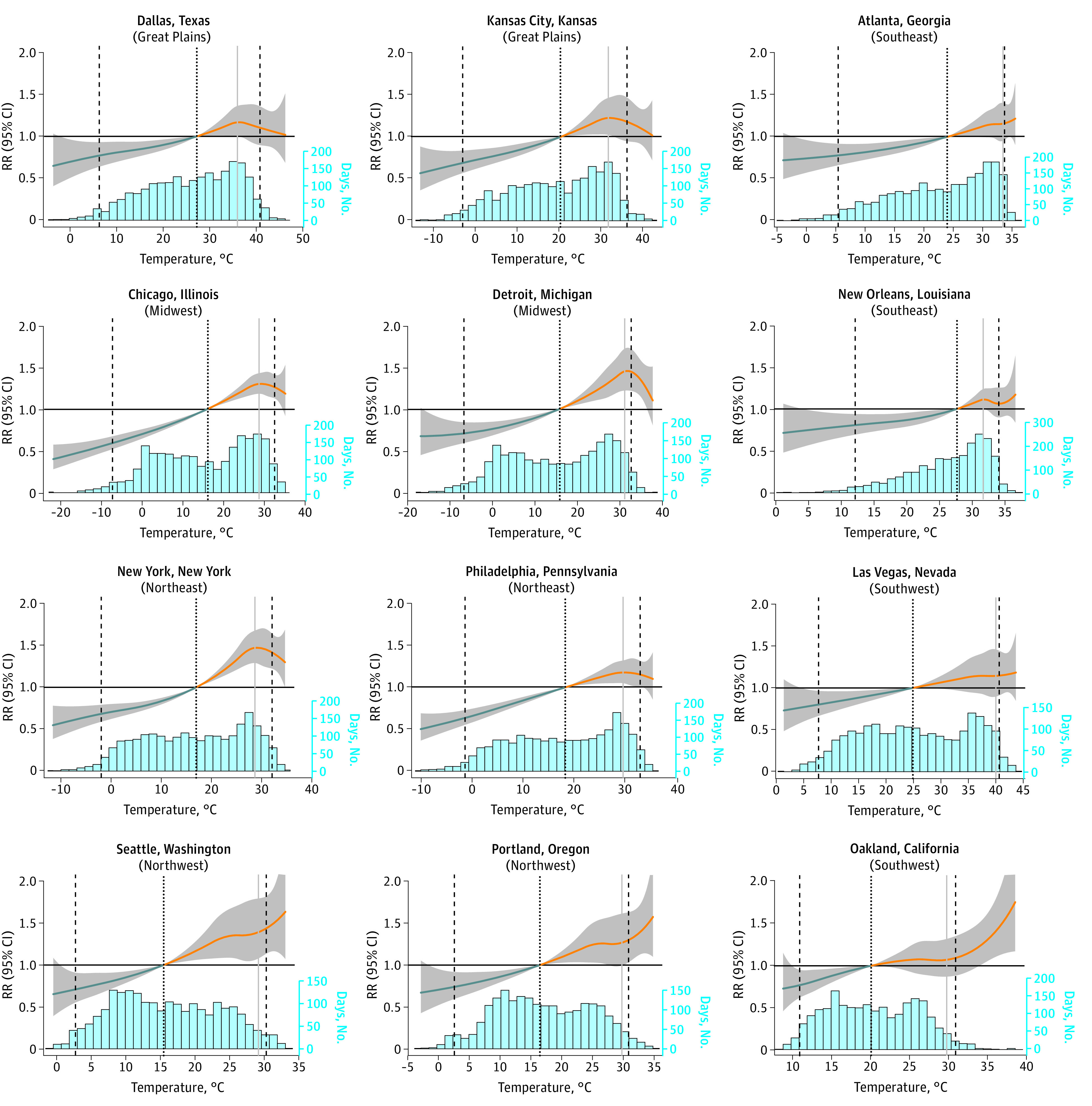
Figure 3. Overall Association of Temperature and Shootings in 12 Cities Across Climate Regions.

These graphs depict the city-specific associations between maximum daily temperature and shootings across the temperature range from the distributed lag nonlinear model specified with a 0-day lag period. Histograms below the graphs show the range and frequency of temperature days for each city. Two cities from each climate region were selected to display. The median temperature of each city was used as the counterfactual scenario for the estimation of relative risks (marked with the black dotted vertical line). Temperatures above the median are considered hot days (orange lines). The 2.5th and 97.5th percentiles of the city-specific temperature range are marked with black dashed vertical lines. The temperature percentile with the highest relative risk is marked with a vertical gray line (constrained to be within the inner 95% of temperature percentiles to avoid potential spurious results due to sparsity at the tails of the temperature range). City-specific association graphs for all 100 cities can be found in eFigure 7 in Supplement 1.
