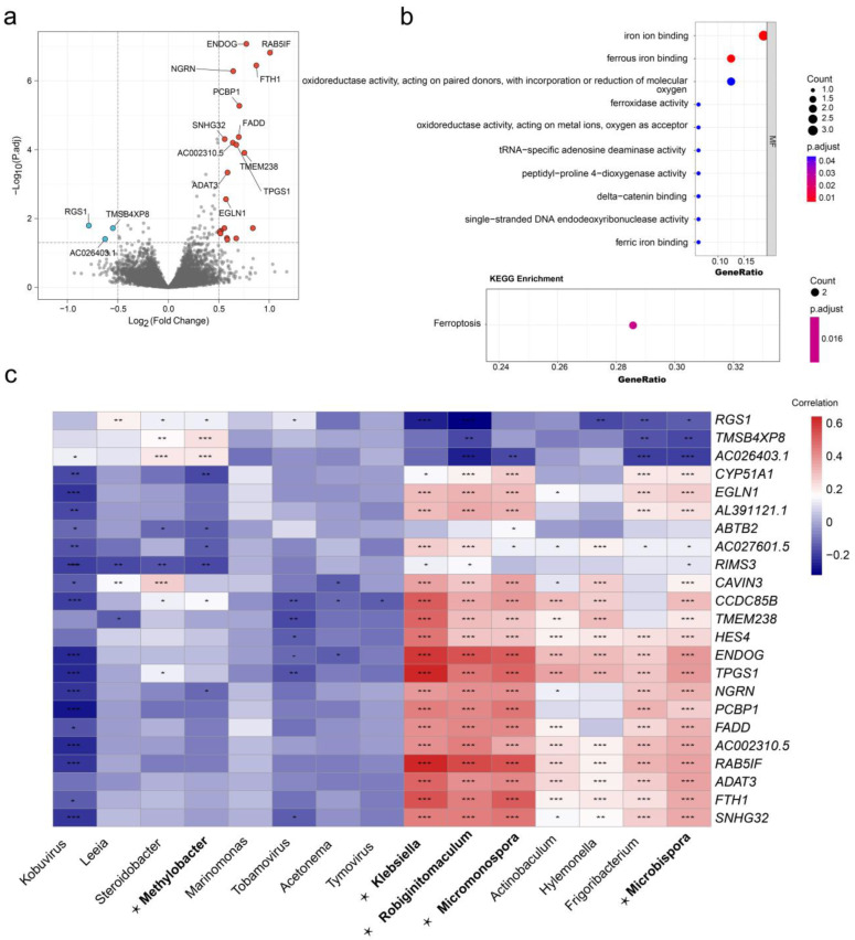
Figure 6.
DEG and functional enrichment analysis of different DEM clusters. (a) Volcano plot of DEG distribution. Red dots indicate high expression in DME cluster 1, and blue dots indicate high expression in DEM cluster 2; (b) analysis of DEGs based on GO and KEGG functional enrichment; and (c) heatmap of correlation between DEGs and all differentially expressed microbiomes, microbiomes in bold and marked with ⋆ are DEMs. (p < 0.05 *; p < 0.01 **; p < 0.001 ***).

