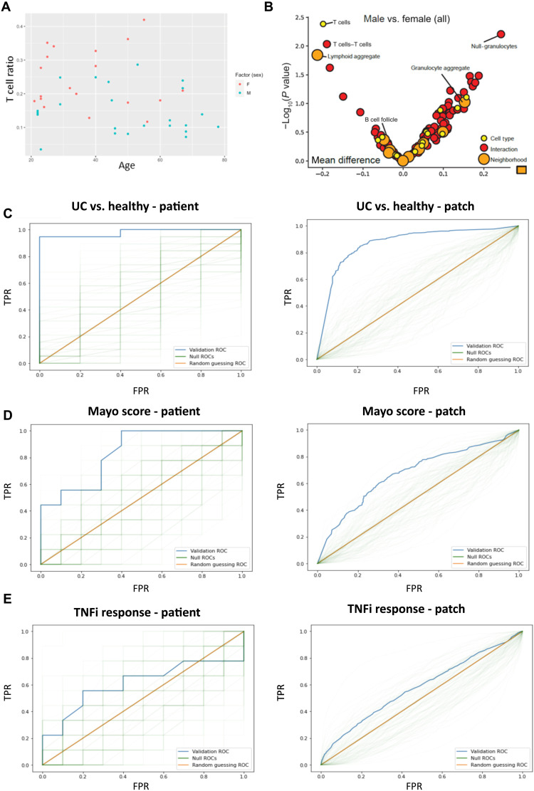
Fig. 4. Sex and TNFi response associated architectural features.
(A) Scatter plot of T cell ratios (no. of T cells/no. of total cells), per patient, plotted against age, demonstrates increased T cells in females (P < 0.01). Female patients are marked in red, and male patients are marked in blue. (B) Volcano plot illustrating T cell–associated interactions and neighborhoods implicated in sex differences. Dots correspond to cell types (yellow), cell-cell interactions (red), and CNs (orange). Features to the left of zero are enriched in females, and features to the right of zero are enriched in males. Features above ~1.3 are statistically significant at the P < 0.05 level. (C) Patient-level (left; P < 0.01) and patch-level (right; P < 0.01) ROC curves for UC versus healthy using patch-level training with the standard representation. The blue curve is the validation ROC, the green traces are the null ROCs, and the orange line represents the AUROC = 0.5 random guessing ROC. TPR indicates true positive rate, FPR indicates false positive rate. (D) Patient-level (left; P < 0.05) and patch-level (right; P < 0.05) ROC curves for mild/moderate versus severe (Mayo 1 + 2 versus 3) using patch-level training with the standard representation. (E) Patient-level (left; P = 0.26) and patch-level (right; P = 0.19) ROC curves for TNFi response using patch-level training with the CNN representation.

