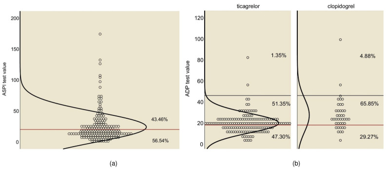
Figure 1.
Response to antiplatelet therapy. (a) Response to aspirin treatment—the red line is drawn at 20, and the curve represents the normal distribution curve. (b) Response to P2Y12 inhibitor treatment, ticagrelor vs. clopidogrel—the red line is drawn at 18 and the black at 46, and the curve represents the distribution curve.

