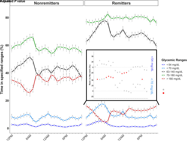
Figure 2.
Daily patterns of time spent in defined glycemic ranges during the first year of type 1 diabetes regarding the remission status. Routine clinical parameters and CGM metrics were obtained at 3, 6, 9, and 12 months after diagnosis. Lines represent the mean percentage of time spent <54 mg/dL (dark blue), <70 mg/dL (light blue), between 63 and 140 mg/dL (black), between 70 and 180 mg/dL (green), and >180 mg/dL (red). Error bars represent the SEs. The inset panel represents the daily variation in the amplitude of differences for values <70 mg/dL (triangles) and <54 mg/dL (circles) between remission groups based on a linear mixed model (i.e., the percentage >0% [dashed black line] defining higher values in remitters, percentage <0% defining lower values in remitters). The significance level of the differences is represented by the color of the points as follows: red dots correspond to P < 0.05, and gray dots represent P > 0.5. No-rem, nonremitters; Rem, remitters.

