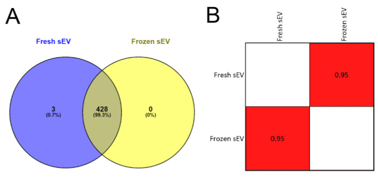
Figure 3.
Proteomic analysis of Fresh sEV and Frozen sEV samples. (A) Venn diagram illustrates the entire proteome of the Fresh sEV and Frozen sEV samples. (B) The correlation matrix shows the comparison of the proteomes of the Fresh sEV and the Frozen sEV samples. Correlation coefficients were obtained using Pearson’s correlation analysis.

