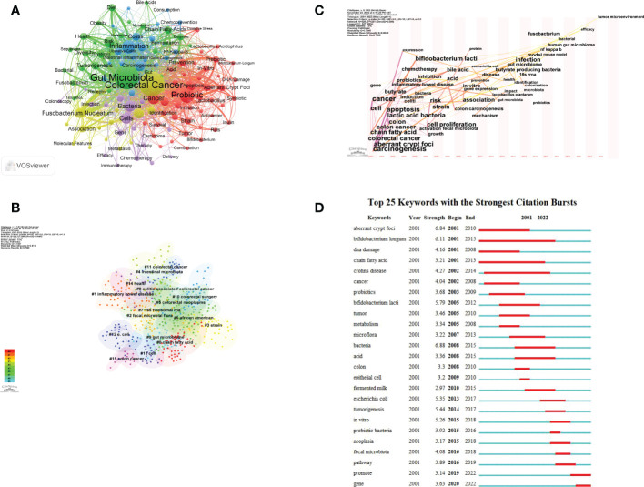
Figure 7.
Keywords visualization related to gut microbiota and colorectal cancer research from 2001 to 2022. (A) The cooperation network of keywords in the field. Dots represent keywords, with larger dots indicating the frequency of keywords, clusters are marked using different colors and links represent co-occurrence between keywords. (B) Keyword clustering analysis in this field. Different colors represent different clusters. Each point represents a keyword and the number on the node represents the cluster the keyword belongs to. The different patterns represented a cluster. Tag# was allocated to clusters, the smaller the count, the more keywords in the cluster. (C) Time-based visualization of keyword variation in the field. Dots represented keywords, with larger dots indicated higher occurrence frequency of keywords, the clusters were labeled using different colors, and the links represented the co-occurrence of keywords. (D) The top 25 keywords with the strongest citation bursts. A blue bar represents the time period in which the keyword appeared; a red bar represents the interval in which the keyword was found to burst, indicating the start year, the end year and the duration of the burst.

