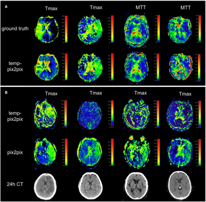
Figure 8.
Two patients with the poorest performance according to the metrics for each of the two datasets (A) and patients for which no AIF could be computed (B). (A) The first and second columns show Tmax for two patients with acute stroke. Whereas the synthesized image in the first column does not fully capture the hypoperfused areas, the generated image in the second column looks quite close to the ground truth. Columns three and four show MTT for two PEGASUS patients. While the generated image in the third column shows less noise than the ground truth, the GAN introduced noise in the fourth column in the synthesized image. (B) Four Tmax maps generated by temp-pix2pix (upper row) and pix2pix (lower row) for cases from the acute stroke data for which no AIF could be computed, and thus with conventional methods not imaging would be available. To get an estimate of the true lesion, 24 h CT is plotted in the lower row. Note that for the CT images, only 2D visualizations were available. Thus, they are not aligned with the perfusion parameter map. Since motion artifacts affect the quality of the time series, in these cases the baseline pix2pix performs better than the temp-pix2pix.

