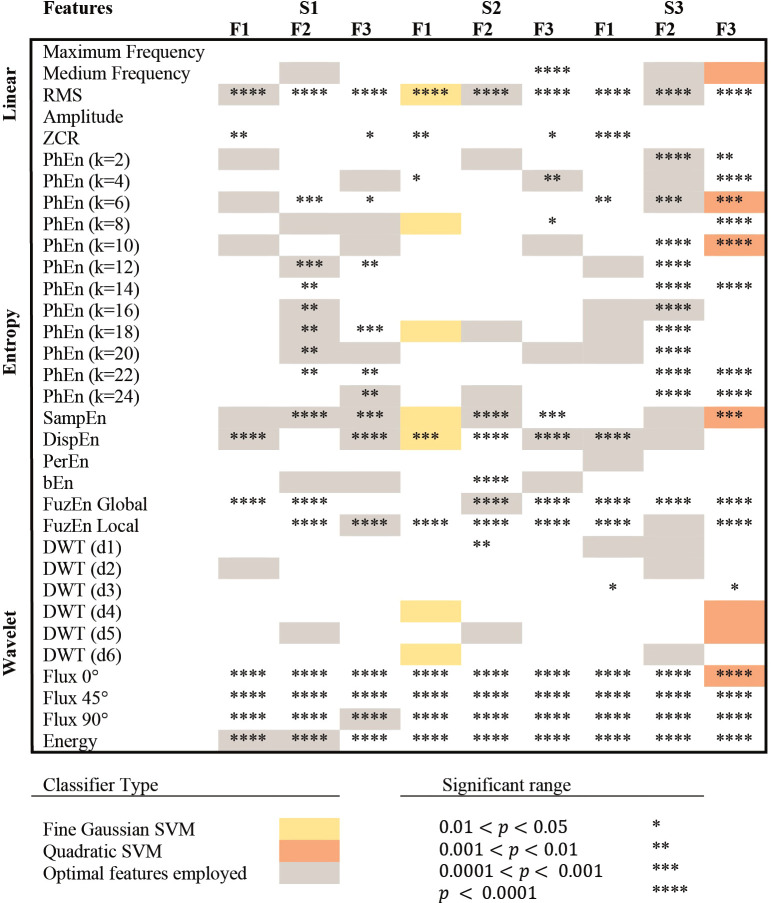
Figure 3.
Selection of features for each classifier. S1, S2, and S3 represent the bipolar channels acquired from the public database, while F1, F2, and F3, represent the frequency sub-bands compared in this study. Colored frames (gray, yellow, and orange) indicate that the feature was selected as an optimal classification parameter and used to train the prediction model. The classifiers that achieved the highest classification accuracy (< 85%) in testing are presented in yellow and orange, indicating the type of classifier used. *,**,***,**** are used to describe significant differences between P and T groups in the Mann-Whitney test, with p-values lower than 0.05, 0.01, 0.001, and 0.0001, respectively.

