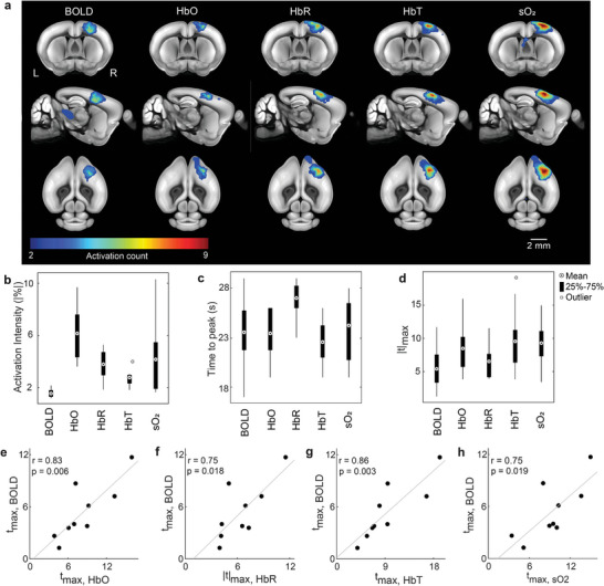
Figure 3.

Group‐level analysis of responses to the sensory stimulation. a) Activation count maps for the different hemodynamic components. Values indicate the frequency of statistically significant activation events for each voxel (nine sequences, n = 6 mice). Count maps are overlaid onto the mouse brain atlas. b,c) Group‐level statistics on the averaged time‐courses from the S1FL brain region. The distribution of activation intensity and TTP values calculated from the time courses of different hemodynamic components are displayed. d) Group‐level statistics on the maximum t‐value (t max) from the S1FL region. The distribution of t max values is displayed for different components. e–h) Scatter plots showing the relationship between t max values. Dots represent individual stimulation sequences. Pearson correlation coefficients (r) were calculated for the plots. Grey lines indicate linear fits for the scatter plots.
