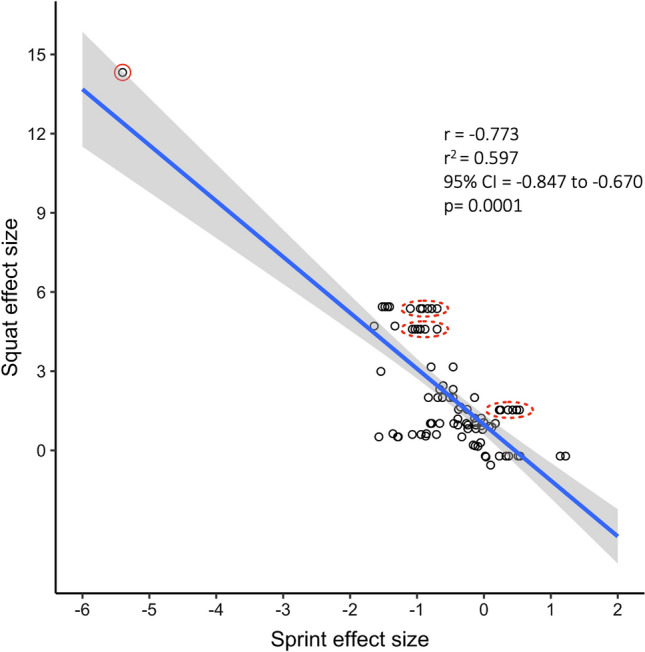
Fig. 1.

Reproduced figure from Seitz et al. [4] (Fig. 2 of Seitz et al. [4]). Red circles have been added to highlight specific statistical issues. The figure shows a scatter plot of squat and sprint Hedges’ g effect sizes (n = 85 effect sizes from 15 studies). The blue line is the linear regression line, and the gray cloud shows the 95% confidence interval (CI). The solid red circle highlights an outlier and the dashed red circles highlight examples of highly correlated observations — these stripes of data arise because the same group was subjected to multiple related sprint measurements. r coefficient, r2 shared variance
