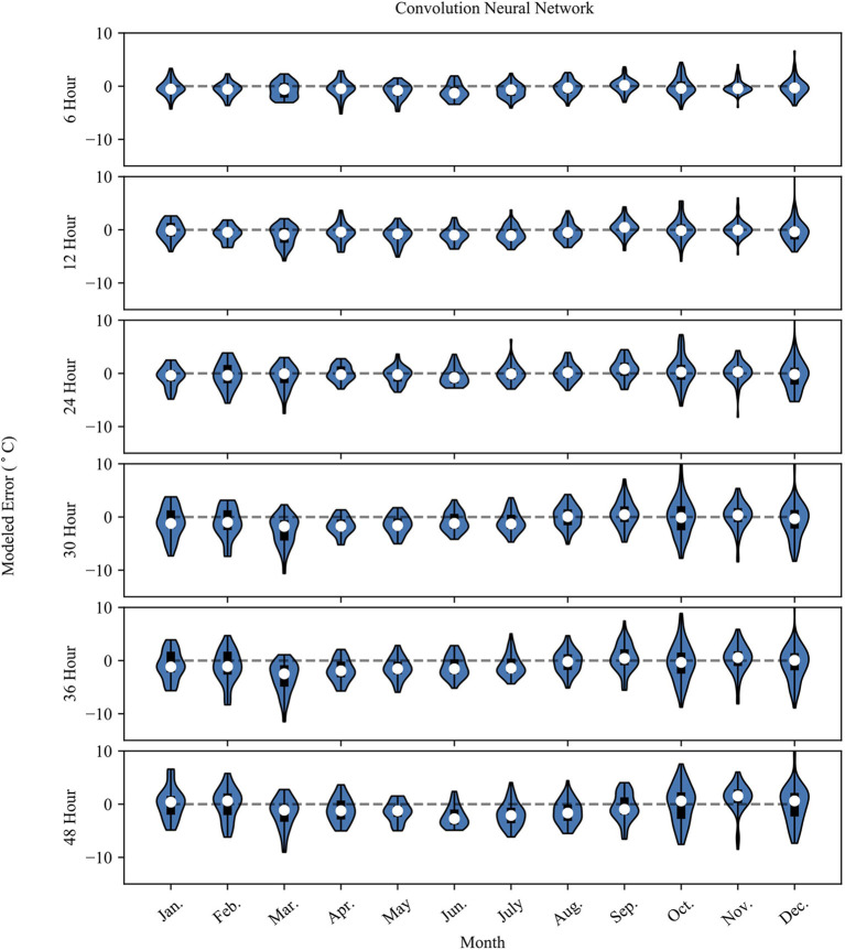
Figure 4.
The plot shows the NN model error (Error = modeled – observed) grouped by month. The white dot represents the mean error for the month, the dark box shows the 25th and 75th percentile. The whiskers extend to the minimum and maximum possible error values. The surrounding blue polygon represents the probability density of the model error.

