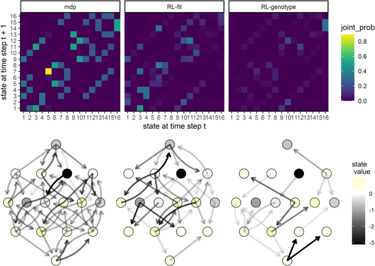
Figure 4. Movement of simulated E. coli population through the genomic landscape.
Top row: Heatmap depicting the joint probability distribution for each state transition under the different experimental conditions. The second two show the difference in state transition probability compared to the MDP condition. Bottom row: Graph depicting the fitness landscape, beginning with the wild type (bottom) all the way to the quadruple mutant (top). Size of arrow depicts the frequency with which a state transition was observed under the labeled experimental condition. The color of each node corresponds with the expected value (to the learner) of being in that state. As above, the second two plots correspond to the observed difference between RL-Fit or RL-genotype and the MDP condition.

