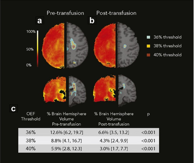
Fig. 8.

Averaged OEF maps before (a), and after (b) CTT. Left side indicates the averaged maps. Right side shows the regions above the OEF thresholds. The median proportion of hemispheric volume above the OEF threshold decreased after transfusion (c). [Adapted from Guilliams et al. (2018) with permission]
