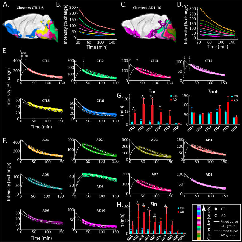
Fig. 5.
Model fitting of cluster time courses. A, C Clusters of the CTL and AD groups respectively selected for further analysis based on a minimum signal intensity change and a minimum number of voxel criterion (see the ‘Methods’ section). B, D Time courses of the selected clusters in the CTL and AD groups respectively. E Model fitting of the time courses of the selected clusters from the CTL group (solid lines, filled circles) is compared to model fitting of the same cluster of voxels in the AD group (dashed lines, open circles). F Similarly, model fitting of the selected clusters of the AD group (dashed lines, open circles) is compared to model fitting of the same cluster of voxels in the CTL group (solid lines, closed circles). In each panel of E and F, lines demonstrate the model fit and circles the data points (also shown in B, D) for each cluster. Colours represent the size sorting of the clusters based on the number of voxels (same as Fig. 4). G Bar graphs of influx (τin) and efflux (τout) time constants for CTL and AD mice in the clusters of the CTL map shown in A. Mean values and sem as well as the p-values are reported in Table 1. H Bar graph of the influx (τin) time constant for CTL and AD mice in the clusters of the AD map shown in C. Efflux is not shown (no significant differences) but values for τin and τout as well as p-values are reported in Table 2. For all bar graphs, ‘*’ denotes statistical significance (N = 5 mice per group; two-sample t-test; p < 0.05)

