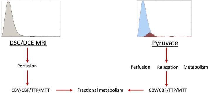
Figure 1.
An example overview of the processing used in this methodology. The graph on the left side of the figure demonstrates the change in relative T1 or R2* observed in a DSC/DCE experiment. The graph on the left demonstrates the signal time course of [1-13C]pyruvate (blue) and subsequent exchange to [1-13C]lactate (brown) observed in a hyperpolarized experiment. The text shows the flow of data from each experiment for the Metabolic Clearance Rate formalism.

