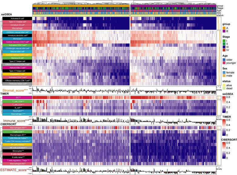
Fig. 3.
Difference of immune score and immune cell infiltration between group A and group B. The results were shown in the form of a complex heat map, in which the abundance of immune cell infiltration predicted by ssGSEA, TIMER, and CIBERSORT between the two groups was presented in the form of a heatmap. The immune score, stromal score, and ESTIMATE score predicted by ESTIMATE are displayed in the form of a bar chart. The yellow density chart on the right side of the heat map shows the average of each index. The statistical method of Mann- WhitneyU test was used to compare the two groups. *: P < 0.05; **: P < 0.01; ***: P < 0.001; ****: P < 0.0001

