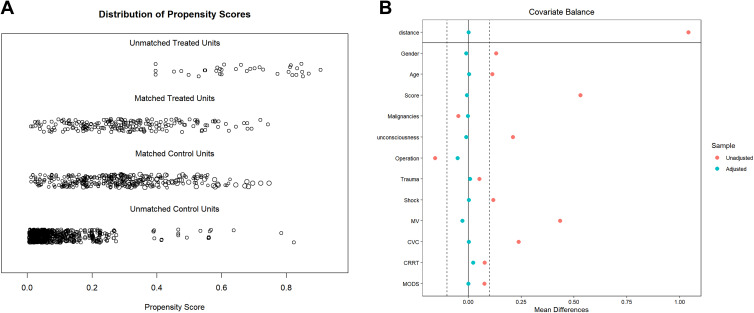
Figure 2.
(A) Jitter plot of propensity score distribution. The distribution of propensity score between the control and infected groups before and after matching is indicated to understand the effect of matching. (B) Standardized difference scatter plot of each covariable. After matching, the corresponding point of the variable falls between −0.1 and 0.1, indicating that the variable reaches equilibrium.

