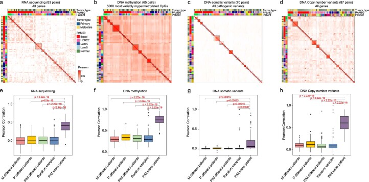
Extended Data Fig. 3. Correlation analysis between paired data in each genomic approach.
a-d. Correlation heatmap representing the correlation matrix of (a) RNAseq data, n = 63 tumor pairs (gene expression values) (b) DNA methylation data, n = 65 tumor pairs (ꞵ-values), (c) DNA somatic variants, n = 20 tumor pairs (binary data: 1, mutated and 0, non-mutated) and (d) DNA copy number variants, n = 87 tumor pairs (gene-specific denoised log2 copy-ratios) of paired primary and metastatic tumors. The relationship between variables has been calculated using the Pearson correlation coefficient. e-h. Comparison of Pearson correlation means between primary and paired metastasis, random primary and metastatic tumors, primaries and metastasis belonging to different patients, primary samples belonging to different patients, and metastasis samples belonging to different patients of (e) RNAseq data, n = 63 tumor pairs (gene expression values) (f) DNA methylation data, n = 65 tumor pairs (ꞵ-values), (g) DNA somatic variants, n = 20 tumor pairs (binary data: 1, mutated, 0 non-mutated) and (h) DNA copy number variants, n = 87 tumor pairs (gene-specific denoised log2 copy-ratios). P values between groups were calculated using t-test, two-sided (panels, e, f, g, and h). In panels e, f, g, and h, all Box-and-whisker plots display the median value on each bar, showing the lower and upper quartile range of the data (Q1 to Q3) and data outliers. The whiskers represent the lines from the minimum value to Q1 and Q3 to the maximum value. P, Primary; M, metastasis.

