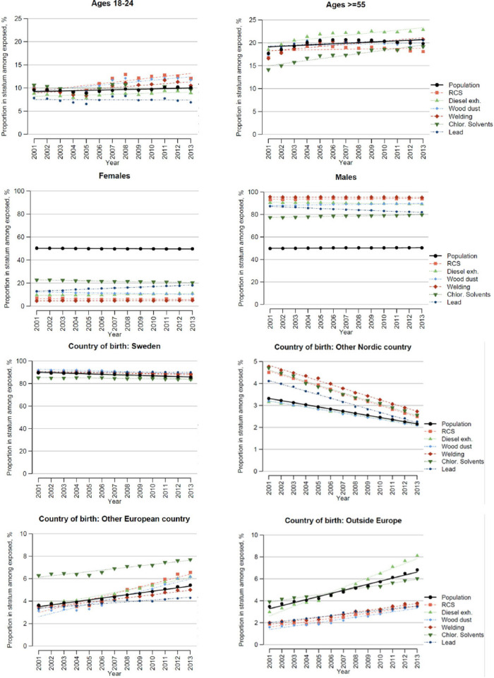
Figure 1.

Distribution of exposed persons and the total population across strata of age, sex, and country of birth. Each graph shows how large proportion of those exposed to each chemical that falls into the respective stratum (coloured dots), and the corresponding proportion of the general population (black dots), over time.
