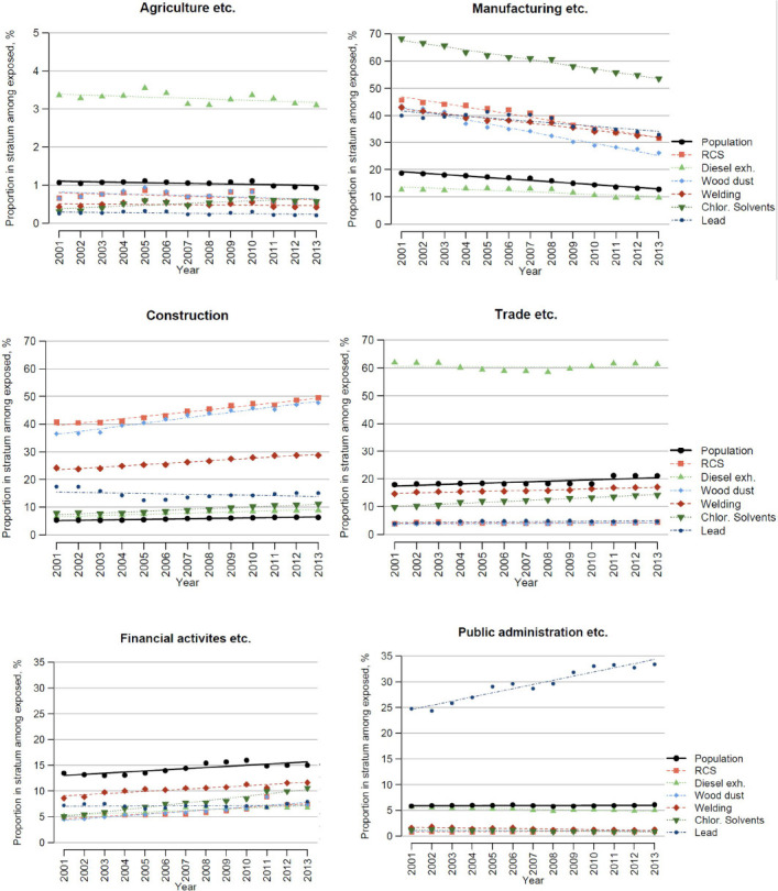
Figure 3.

Distribution of exposed persons and the general population across industry branches. Each graph shows how large proportion of those exposed to each chemical that falls into the respective industry branch (coloured dotted lines), and the corresponding proportion in the population (black solid line) over time.
