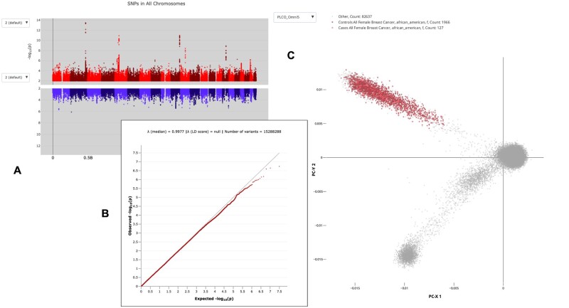
Fig. 1.
Three examples of graphic representations of PLCO data pulled directly by PLCOjs SDK from this data resource API. The live individual plots, (A) Manhattan plot comparing two populations, (B) quantile–quantile log plot of expected and observed variation frequency, (C) First two principal component representations of case versus control variations for 84 730 individuals. These and other plots can be reproduced, and engaged interactively, in the Observable Notebook Supplementary Material. Plot A also illustrates the portability of calling PLCOjs SDK from within HTML Custom Elements

