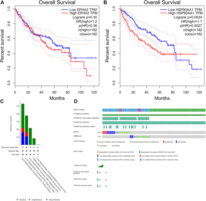
FIGURE 7.
(A, B) Survival analysis of high and low expression populations of EPHA2 and HSP90AA1. (In the figure, the red curve refers to the population with high expression in the TCGA database, and the blue curve refers to the population with low expression in the TCGA database. The P value represents the statistical difference in the survival curve between the two groups). (C, D) Genetic mutation analysis of EPHA2 and HSP90AA1 in various TCGA datasets. (C) The percentage of total mutations of EPHA2 and HSP90AA1. (D) The mutations of EPHA2 and HSP90AA1 in each sample.

