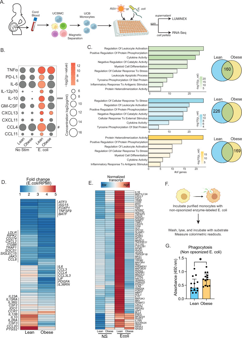
Figure 2. Cord blood monocyte responses to ex vivo E. coli infection are attenuated with maternal obesity.
(A) Experimental design for in vitro bacterial and viral stimulation. Purified monocytes were cultured in the presence/absence of E. coli or RSV for 16 hr. Cell pellets were used for bulk RNA-Seq analyses and supernatants were used for Luminex analyses of secreted cytokines and chemokines. (B) Bubble plot of key secreted factors significantly different following E. coli infection. The size of the bubble represents the quantity of the secreted analyte (log-transformed) whereas color represents statistical significance relative to no stimulation controls. Statistically significant analytes between lean and obese groups are highlighted with # - p<0.05. (C) Venn diagram (right) and corresponding functional enrichment (left) of genes upregulated with E. coli infection in lean and obese groups (Green denotes common DEG, blue DEG unique to lean group, and yellow DEG unique to the obese group) using metascape. The length of the bar indicates the number of genes in each gene ontology (GO) term. Color represents the statistical significance of each GO term. (D) Heatmap comparing fold changes of the genes upregulated in both groups (77 genes) that mapped to GO terms ‘myeloid cell differentiation’, ‘inflammatory response to antigenic stimulus’, ‘leukocyte apoptotic process’, ‘regulation of leukocyte activity’, ‘cytokine activity’, and ‘positive regulation of protein phosphorylation’. (E) Heatmap comparing normalized transcript counts (blue – low to red – high) of genes exclusively upregulated in the lean group following E. coli infection. (F) Experimental design for measuring ex vivo phagocytosis by cord blood monocytes. (G) Bar graph depicting colorimetric readout of phagocytosed E. coli particles by UCB monocyte. * or /#- p<0.05, #### - p<0.0001.


