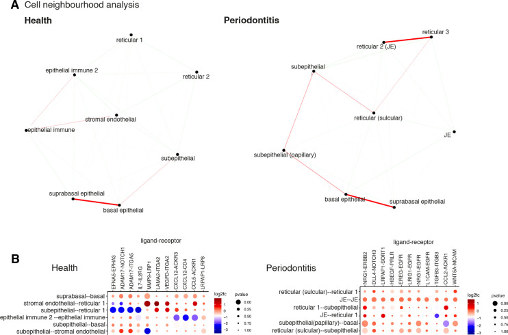
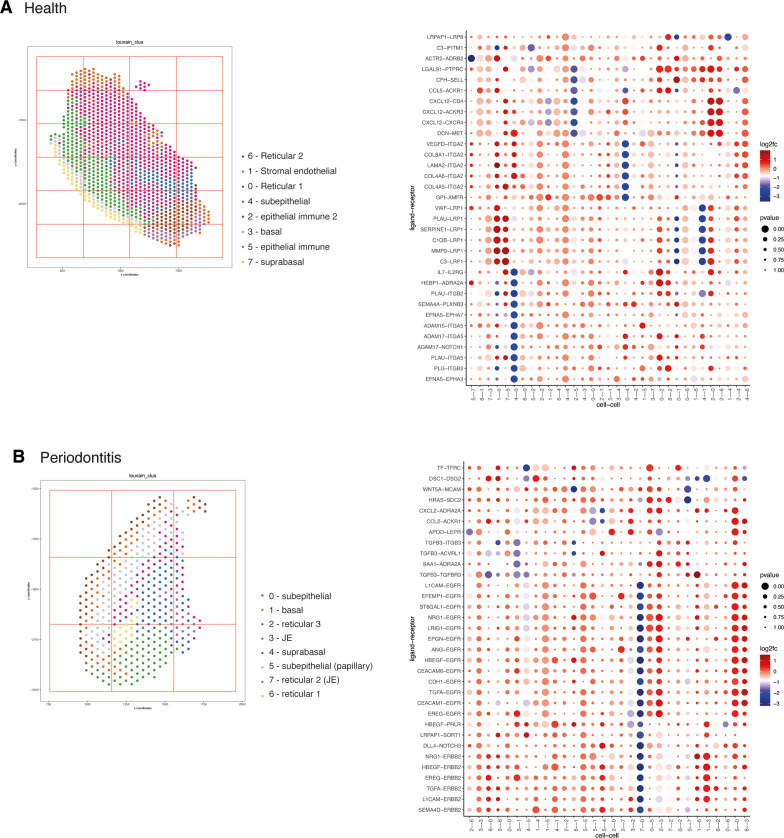
Figure 4. Cell neighbourhood analyses in health and disease.
(A) Network representation of the pairwise interacting regions identified by Giotto Analyzer (Dries et al., 2021), whereby it evaluates the enrichment of the frequency that each pair of regions is proximal to each other. Enriched interactions are depicted in red. We observed strongest interactions within epithelial layers in health, whereas in disease stromal regions interactions emerge. (B) Dotplot for ligand–receptor pairs that exhibit differential cell–cell communication scores due to spatial cell–cell interactions. The size of the dot is correlated with the adjusted p value, and the colour indicates increased (red) or decreased (blue) activity.


