
FIGURE 2.
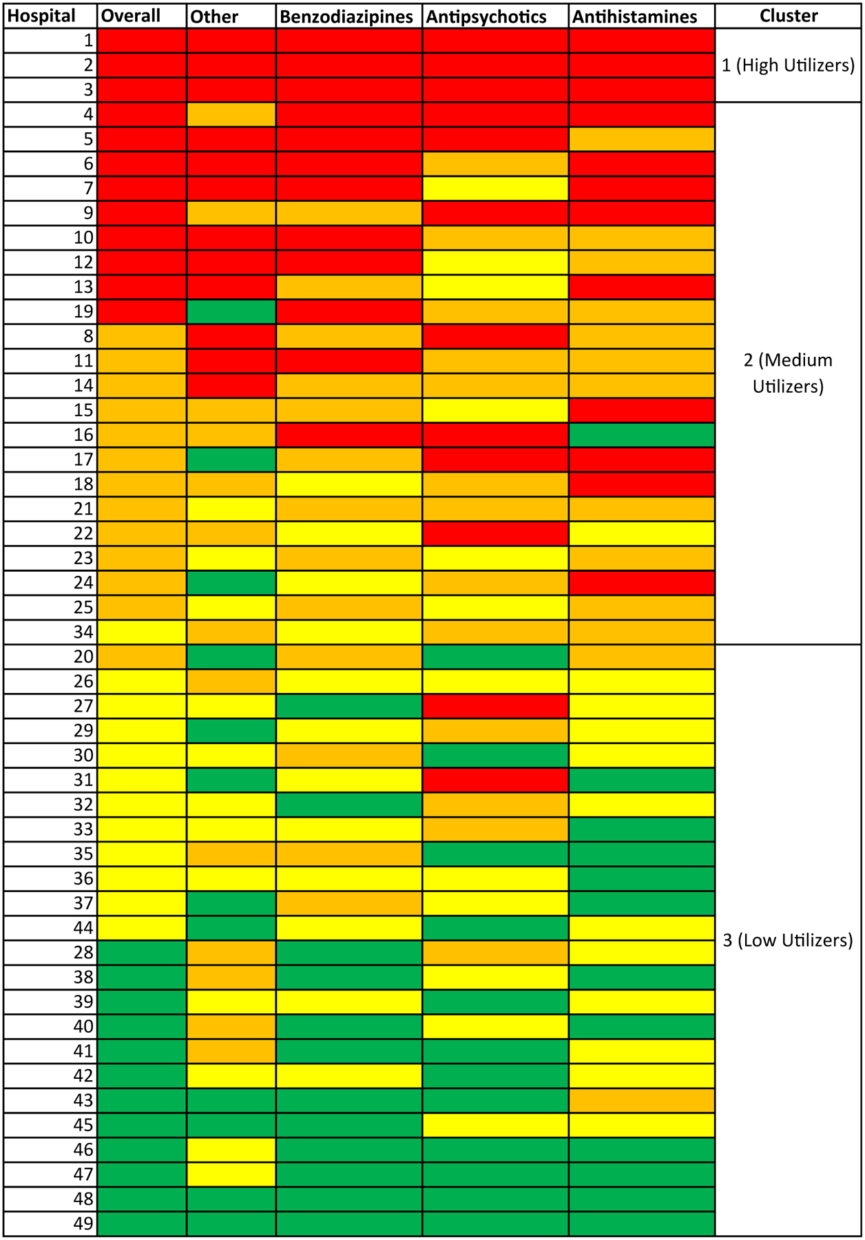
Heatmap and cluster analysis of pharmacologic restraint use. Hospitals are sorted by highest to lowest overall use with the cluster number indicated. Overall drug use and drug use by class are displayed as columns. Color values correspond to use quartiles, with red shading indicating higher use, followed by orange, yellow, and finally, green shading indicating lower use.