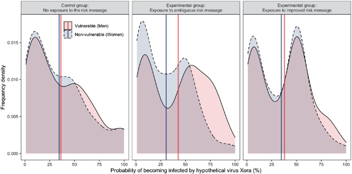
Figure 8. Participants’ Perceived Infection Probability From Hypothetical Virus Xora.
Note. The figure shows perceived infection probabilities for vulnerable (men) and nonvulnerable (women) individuals as a function of the experimental message condition (control—no risk message, left panel, n = 152 vs. ambiguous risk message, middle panel, n = 151 vs. improved risk message, right panel, n = 151). The shaded area shows the frequency density of responses. Solid vertical lines give the mean probability estimate in each condition. See the online article for the color version of this figure.

