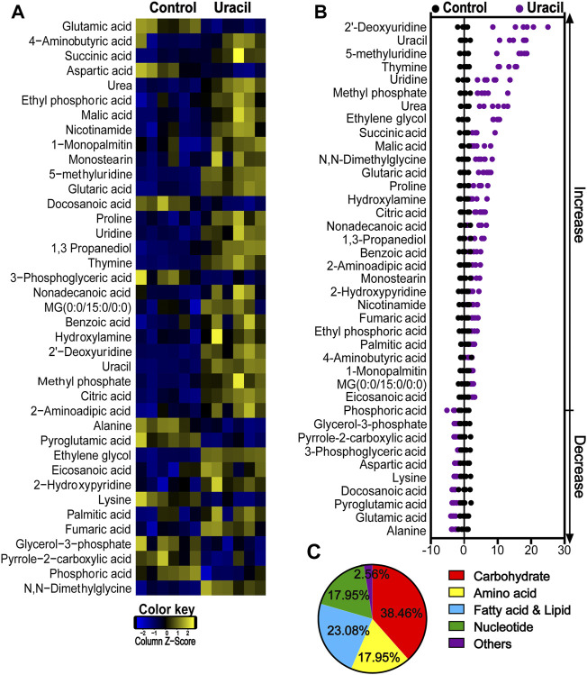
FIGURE 2.
Changes in differential metabolites of USA300 in response to uracil treatment. (A) Heat map showing differential abundance of metabolites. Blue and yellow colors indicate lower and higher abundances of the metabolites relative to the mean level of the control group, respectively (see color scale). (B) Z-score plots of changes in differential metabolites based on control. The data were respectively scaled to the mean and standard deviation of control. Each point represents one biological repeat. Different treatments are distinguished by the color. (C) Categories of differential abundance of different metabolites.

