
Fig. 2. Classification of protein quantitative trait loci (pQTLs, cis and trans) and subsequent partition of the explained variance in plasma abundances of protein targets.
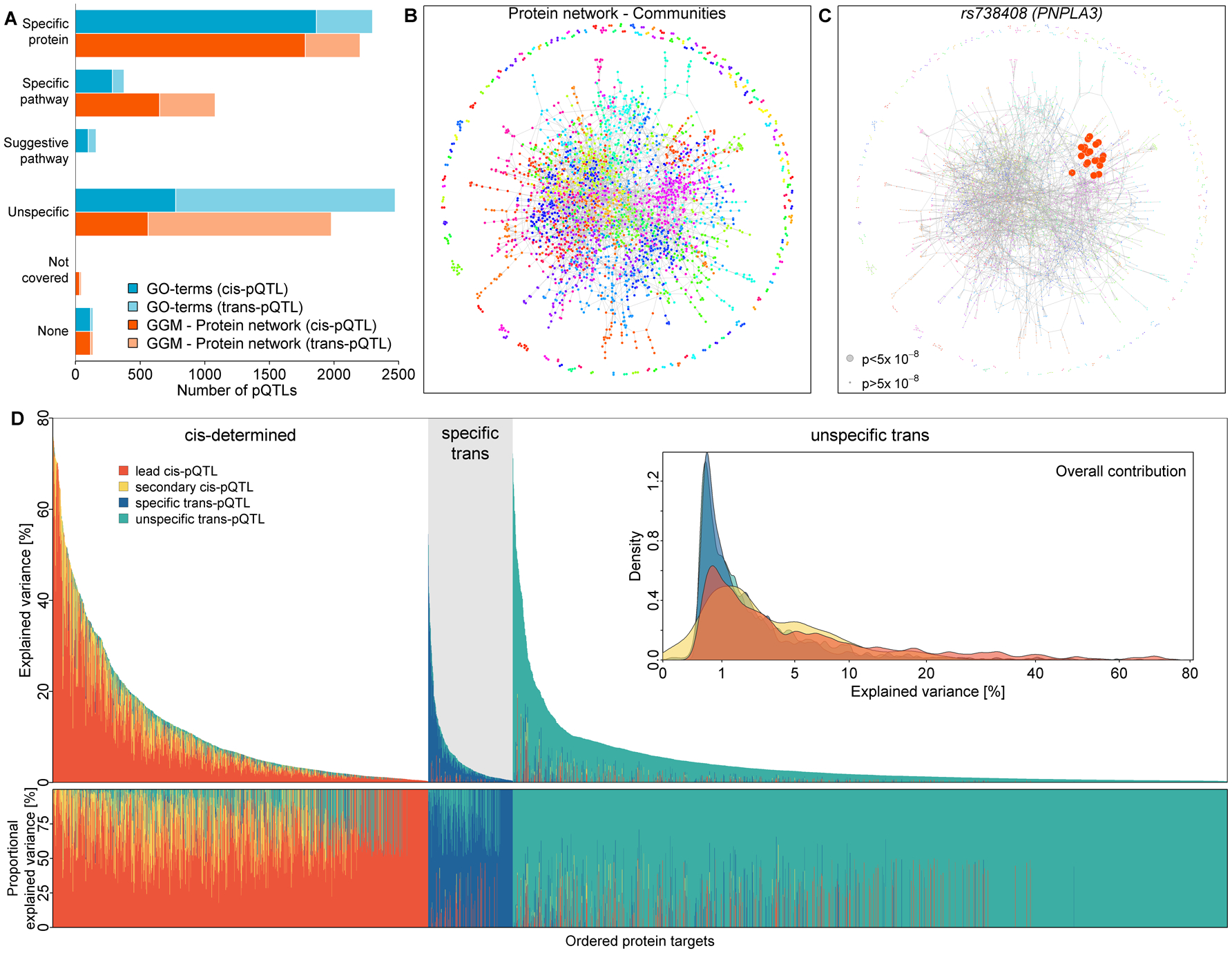
A) Bar chart of pQTL classification based on GO term mapping (blue) or community mapping in a protein network derived by Gaussian graphical modeling (GGM; orange) of associated protein targets. Darker shades indicate cis-pQTLs and lighter colors trans-pQTLs. B) Data-driven protein network colored according to 191 identified protein communities. C) a community-specific pQTL (PNPLA3) that was not captured by GO term mapping. Gene annotation as reported in the Materials and Methods. D) Absolute (upper panel) and relative (lower panel) explained variance in plasma abundances of protein targets by identified pQTLs. Coloring indicates contribution of the lead cis-pQTL (orange), secondary cis-pQTLs (yellow), protein- or pathway-specific trans-pQTLs (blue), and unspecific trans-pQTLs (green). Protein targets have been grouped by underlying genetic architecture as: mostly explained by cis-pQTLs (‘cis-determined’), mostly explained by specific trans-pQTLs (‘specific trans’), and mostly explained by unspecific trans-pQTLs (‘unspecific trans’). The inset displays the overall distribution of explained variance by each of the four categories. The variance explained was computed using linear regression models. A graphical display of effect size distributions can be found in Fig. S3.