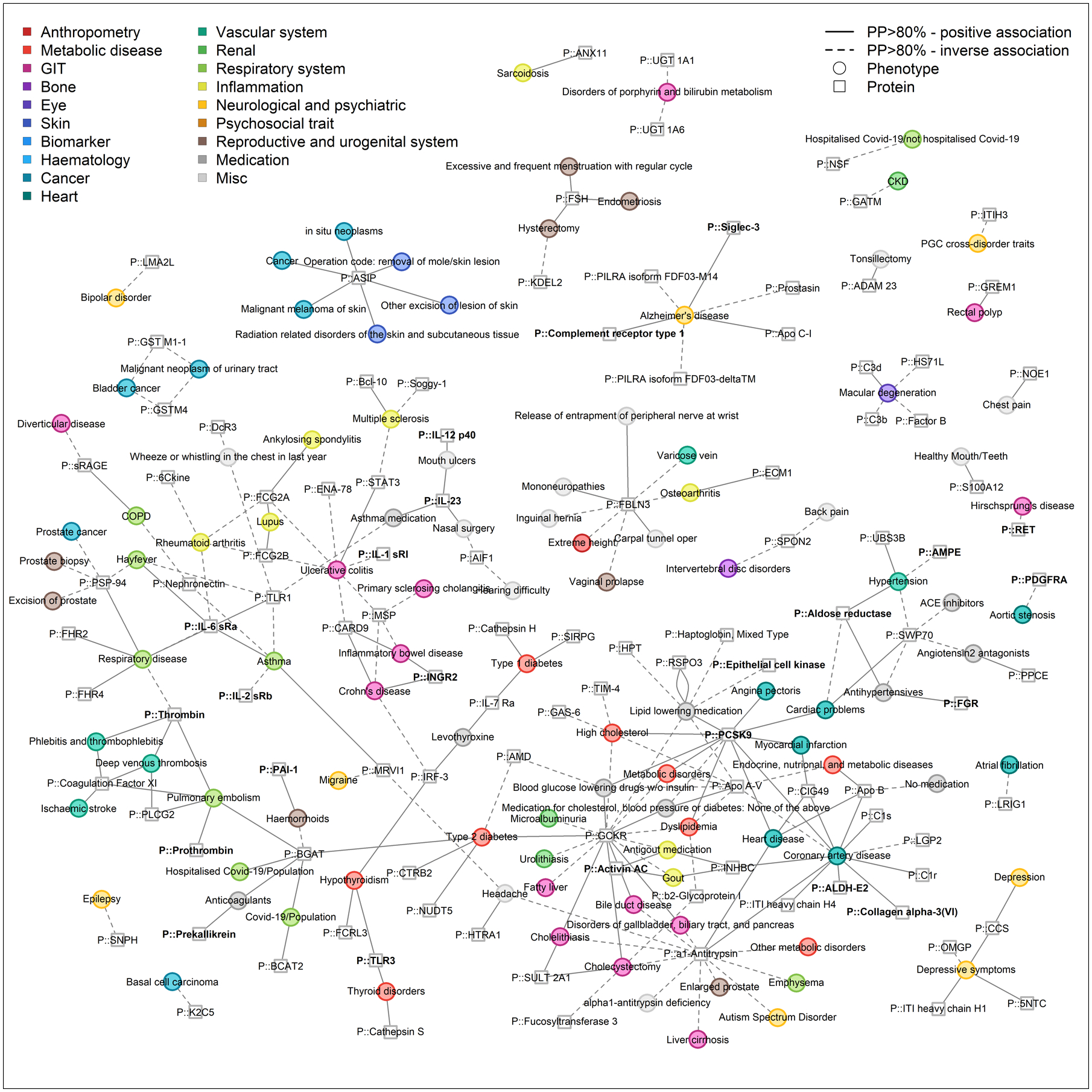
Fig. 5. Network representation of phenome-wide colocalization analysis for protein-encoding loci.

This figure is restricted to connections between proteins and binary endpoints, mainly diseases, to increase visibility and show shared etiology. Only protein targets and phenotypes with at least one connection are included. Effect directions are indicated by the line type (solid = higher protein abundance, increased risk, dashed = higher protein abundance, reduced risk). Colors indicate categories of phenotypes. The entire network is composed of 412 protein targets (squares) and 506 phenotypes (circles) as nodes, which are connected (n=1,859 edges) if there is evidence of a shared genetic signal (posterior probability >80%) and is shown in Fig. S6. An interactive version of the figure can be found at www.omicscience.org/apps/pgwas.
