
Figure 2.
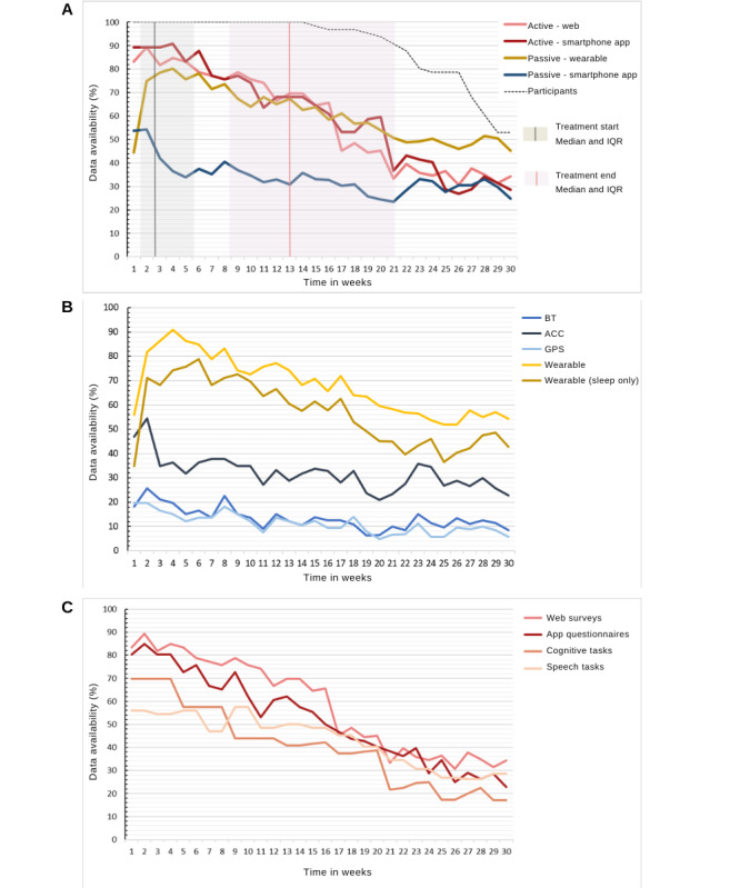
(A) Data availability by type of data. Y-axis 1 shows the percentage of people who contributed data out of the total number of available participants. Participant numbers are plotted against the secondary y-axis. (B) Data availability by passive data stream. This shows the proportion of participants with available data, averaged per week. Data were deemed available if there was at least one data point available per hour on at least 8 hours a day. (C) Data availability by active data. This shows the proportion of participants with at least one active data task completed, averaged per week. IQR: Interquartile range, ACC: accelerometer; BT: Bluetooth.