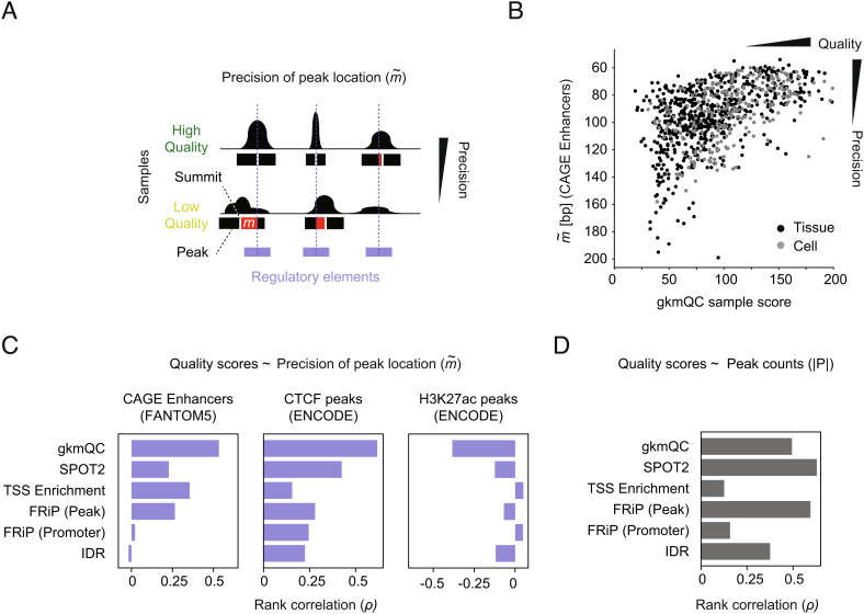
Fig. 2.
Evaluating QC methods with the precision of peak locations. (A) A concept diagram depicts precisions of peak locations in high- and low-quality samples. The red bar shows m that represents the positional mismatch of a peak and the overlapping annotations for potential CREs. (B) gkmQC and the precision of peak locations () for CAGE enhancers were compared in the scatterplot. The Y axis for the parameter is reversed so that samples in right-top corners are HQ samples. Spearman’s rank correlation coefficients (ρ) are calculated for these comparisons. Black and gray dots are tissues and cells, respectively. (C) The rank correlation of quality metrics and was compared for six QC methods using three independent annotations. (D) The rank correlation of quality metrics and peak counts was compared across QC methods.

