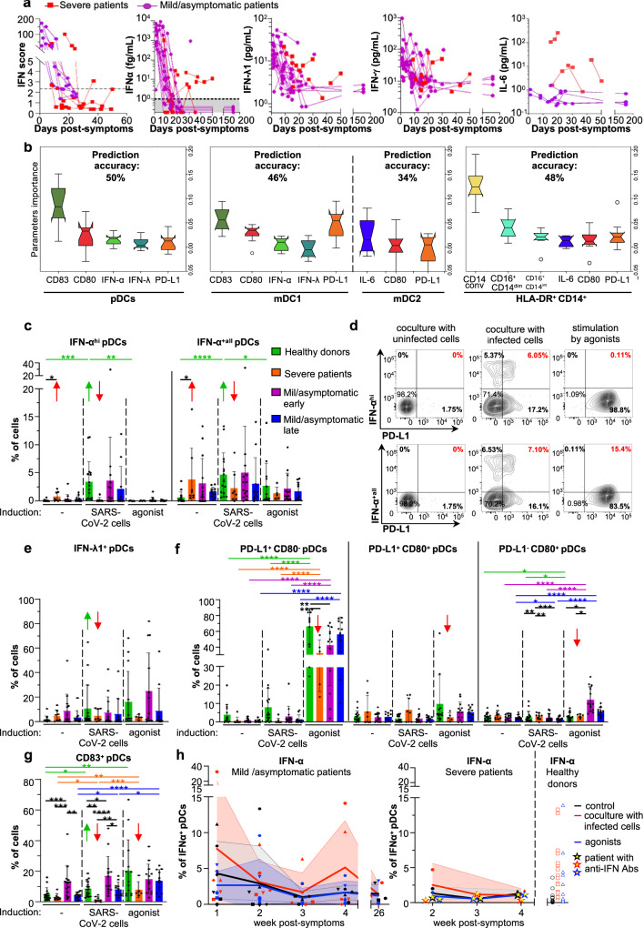
Fig. 2. Innate responses against SARS-CoV-2-infected analyzed for patients with various COVID severities.
a Kinetic analysis of cytokine profile of severe and mild/asymptomatic COVID-19 patients. Determination of the IFN score in whole blood as well as secreted IFN-α, IFN-λ1, and IFN-γ, and IL-6 in plasma, at the indicated time-points. b–i PBMCs issued from the indicated groups of patients (i.e., severe, mild/asymptomatic early, mild/asymptomatic late, and healthy donors, see description of the patients in Table 1 and Supplementary Table 1, and Material and Methods section) were cocultured for 14–16 h with SARS-CoV-2-infected or uninfected A549-ACE2 cells, or treated with agonists [31.8 µM R848 and 42.22 µM polyI:C or 2.04 µM LPS], followed by the multiparametric analysis using flow cytometry. b Analysis of the flow cytometry dataset using a Machine learning approach based on Gradient Boosting. Upper-titles indicate the predictive accuracy in the validation set of samples for each cell type gated as pDCs, mDC1, and mDC2 subsets and HLA-DR+CD14+ monocytes (see gating strategies in Supplementary Fig. 2a). Graphs display the importance of the parameters in predicting the severity/group of patients from the validation set, via comparative analyses of all cell surface expressed-differentiation markers and intracellular cytokines defined in different cell types. Error bars correspond to the standard deviation of the mean importance of each parameter for each of the 10 downsampling iterations over all iterations. The bounds of the box plots correspond to the Interquartile Range (IQR) and the median is displayed as a line in the box. Notches represent the confidence interval (CI) around the median. In case values of the CI are less than the lower quartile or greater than the upper quartile, the notches will extend beyond the box, giving it a distinctive <<flipped>> appearance. The lower whisker corresponds to [Q1–1.5 × IQR (where Q1 corresponds to the first quartile)], while the upper whisker corresponds to [Q3 + 1.5 × IQR (where Q3 corresponds to the third quartile)]. Beyond the whiskers, data are considered outliers and are plotted as individual points. c, d Quantification of the frequency of cells positive for IFN-αhi/IFN-α+all (c) and representative dot blots of flow cytometry analyses (d). e–g Quantification of the frequency of IFN-λ1+ (e) and the differentiation markers CD80, PD-L1 (f) and CD83 (g) in gated pDCs. c, e–g Error bars represent the means ± SD; each dot represents the level determined for PBMCs from one individual patient in each group, or healthy donors and for all experimental condition; the p values are indicated as follows: ≤0.05 as *; ≤0.005 as **; ≤0.0005 as ***; and ≤0.00005 as ****. h Kinetic analysis of the ability of pDCs from patients referred to as mild/asymptomatic (left panel), severe (middle panel), and healthy donors (right panel) to mount an IFN-α+ response upon ex vivo stimulation with SARS-CoV-2-infected cells (red) agonist (blue) versus control cells (grey). Dots for the severe COVID-19 patient with circulating anti-IFNAR antibodies (see description in Supplementary Table 1) are represented by yellow-centered stars. Patient PBMCs were collected from the symptom onset and results correspond to the timeframes as follows, defined in weeks: 1 = [Days 1–8]; 2 = [Days 8–15]; 3 = [Days 15–22]; 4 = [Days 22–30]. Means (colored lines) and errors (colored areas) are indicated (n = 20–24 analyzed patients). Source data are provided as a Source Data file.

