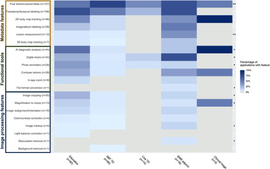
FIGURE 3.

Feature frequency across skin imaging applications, by primary function. (A) Heatmap of the frequency of individual features, relative to primary function. Features are grouped and labeled by feature category on the y‐axis. Darker blue hues correspond to higher percentages and grey indicates 0%. In the rightmost column, * indicates p‐value <0.05 and ** indicates p‐value <0.01 for individual feature differences by primary function
