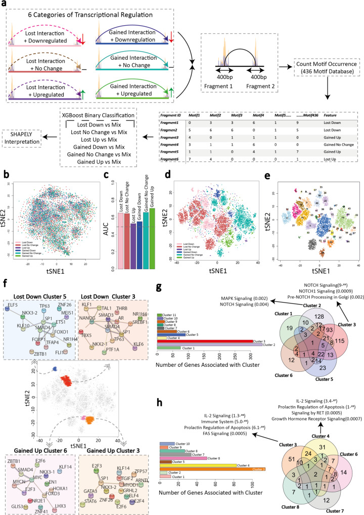
Fig. 5. Machine learning algorithms identify distinct TF motif compositions that define responses to PML::RARA binding.
a Classification of PML::RARA-associated fragments into six gene interaction/expression categories. Transcription factor motif analysis for both interacting fragments is carried out across 400 bp in the center of the ATAC-seq peaks. The motif composition for each fragment is used to develop machine learning models. b tSNE plot visualizing the clustering of ATAC-seq peaks based on motif composition similarities without machine learning interpretation. Each dot represents an ATAC-seq peak and is colored according to the interaction/expression category to which the peak-containing fragment belongs (pink, lost/downregulated; brown, lost/no change; purple, lost/upregulated; blue, gained/downregulated; teal, gained/no change; green, gained/upregulated). c Bar plot showing the AUC scores for each one-vs-all machine learning model. Dashed line (0.5) represents random predictions, and scores above that indicate predictive power. AUC = Area Under the Curve. d tSNE plot visualizing clustering of ATAC-seq peaks based on the SHAPELY weighting derived from machine learning. Each dot is colored according to the interaction/expression category to which the fragment containing the ATAC-seq peak belongs. e Identification of ATAC-seq peak clusters based on the SHAPELY weighting scores derived from machine learning. Each cluster is assigned a color using DBSCAN identified clusters; those points not assigned to a cluster are removed from the plot. f Protein–protein Interaction network of TFs, which bind the top 15 predictive motifs in a downregulated/lost interaction cluster (#5 and #3, blue and red, respectively) and in an upregulated/gained interaction cluster (#6 and #3, pink and orange, respectively). Circles are TFs and lines show known and predicted physical interactions between them as identified by the STRING database. PML and RARA are denoted as stars. Each plot centers around the tSNE plot highlighting clusters to which each network refers. g Bar plot (left) indicating the numbers of genes associated with each of the 11 downregulated/lost interaction clusters identified from (e). Venn diagram (right) showing the overlap of genes within the five largest clusters. For two clusters (#3 and #4), the top three enriched pathways are shown. h Bar plot (left) indicating the numbers of genes associated with each of the ten upregulated/gained interaction clusters identified from (e). Venn diagram (right) showing the overlap of genes within the five largest clusters. For two clusters (#3 and #4), the top three enriched pathways are shown. Source data are provided as a Source data file.

